Overview
The page you land on, panel by panel.
The Overview is one screen that answers “where do we stand”, scoped by the filter bar at the top. Everything on it reads from the same scope, which is why the filters live once at the top rather than being repeated per panel.
The filter bar

Three scopes, and each one changes the denominator of every figure below it:
- Period — how far back the chats are drawn from.
- Model — one model, or all of them. Models disagree; the all-models figure is an average over that disagreement, so it is worth checking a metric per model before concluding anything about it.
- Topic — one topic’s prompts, or all of them.
A filter appears only when there is more than one thing to filter by. A project measured in one market does not get a market selector, because a menu offering “All countries” and “US” is two choices that select the same rows.
Visibility
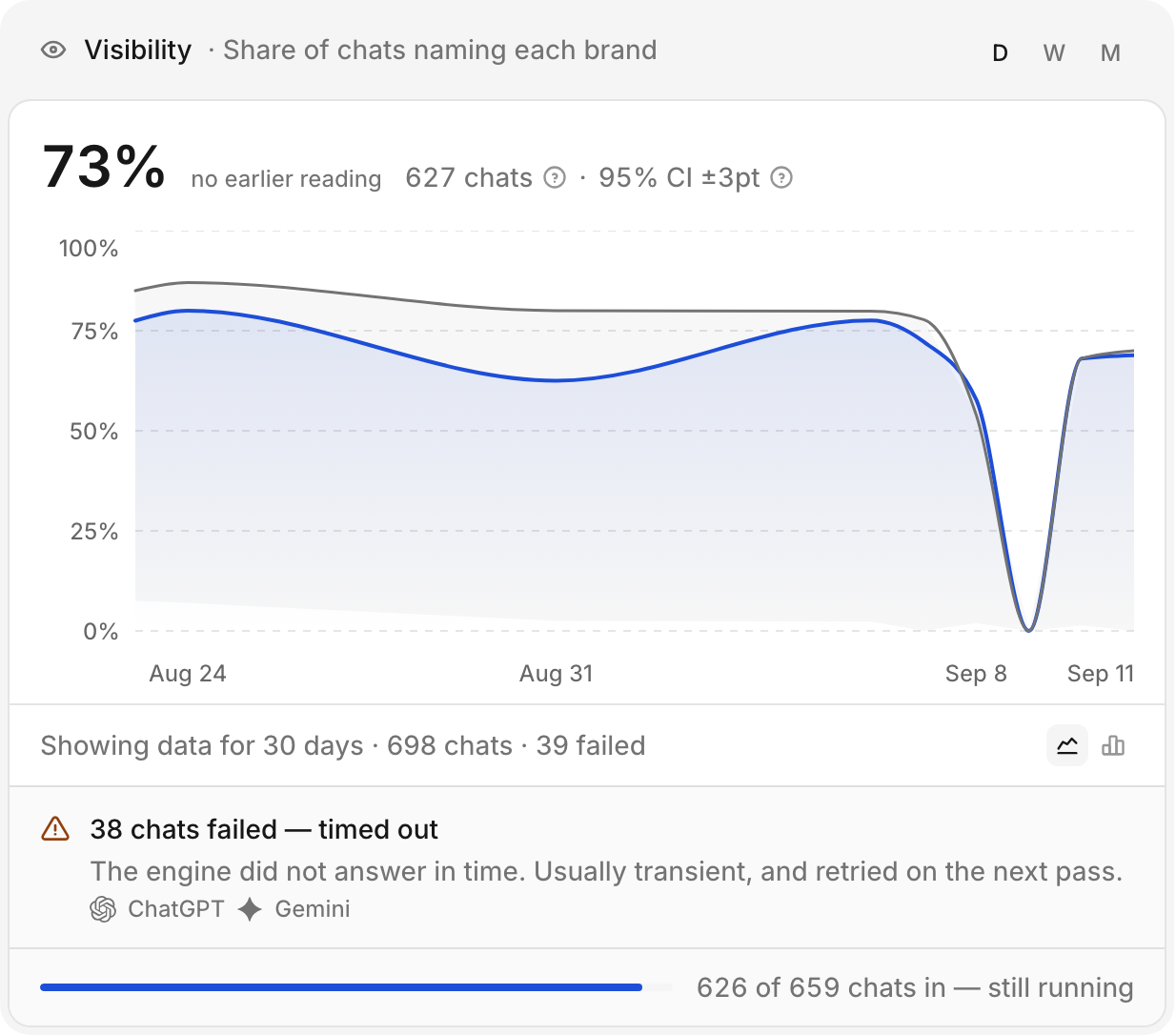
The headline is visibility over the whole window, with its sample size and confidence interval beside it — those two are what make the percentage a reading rather than a number.
The chart carries two series. The filled one is you; the plain line is the
category leader on that day, which is not necessarily the same brand each
day. D / W / M change the granularity.
Below the chart, the panel says how many chats it is showing and how many failed. A failed chat is a model that did not reply — usually a timeout, and retried on the next pass. It is shown rather than hidden because a figure measured over most of the chats that were asked is a slightly different claim from one where everything came back.
Rankings
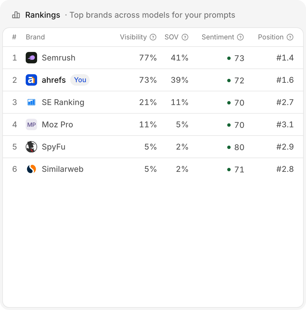
Every tracked brand, yours marked, with all four metrics side by side. This is the panel to read when a single figure looks good — the interesting information is usually in the disagreement between columns. See Metrics overview for the patterns worth recognising.
Market

What the questions above are drawn from, priced. The headline is the category value: what the market pays per month to own the intents this brand competes on, built from the keywords it and its rivals are contested on.
The bar divides that total into the two parts that are sums of money, and the legend gives each in dollars:
- Covered by a tracked topic — value a topic you ask questions about reaches.
- No prompt tracks it — demand no question measures. The part to act on, and the one Keywords gives a button for.
Inside the covered part, a darker fill shows the share of it the answers name you in — the captured figure. It is a share, read out as a percentage, and never as a dollar amount. It is drawn only when it is a reading: before any answers have landed against a priced topic, or when the topics carrying it are too thin to read, the panel says so in words in its header instead.
A pool that has been priced but not yet placed onto topics shows as one whole bar with no seam, waiting on the topic pass. The panel does not render at all until a pool has been built, which happens on the schedule.
The money and the percentage are never multiplied
The panel says what share of a priced market the answers reach. It never prints a figure for “value captured”, because being named in an answer is not a click. See how a keyword is priced.
Top domains
The sites the chats actually leaned on, ranked. Each row carries:
- Retrieved — the share of chats that reached for it at least once, cited or not.
- Citation rate — citations ÷ the chats that retrieved it: how heavily a chat that opened it ends up quoting it.
- Type — what kind of site it is.
The panel is ranked by Retrieved, and it is the same query the
Sources page runs — rows here and rows there are the same
domains with the same numbers, grouped the same way.
The Type column is the one to scan. A category whose chats rest mostly on
Reference and Editorial sources behaves differently from one resting on
UGC: the first is won with documentation and coverage, the second in
communities.
Rows open into the source’s own page. Full detail is on Sources.
Domain types
The same citations, aggregated by kind — what proportion of the evidence behind your category’s chats is corporate, editorial, reference, UGC, owned or competitor.
This is a shape-of-the-category panel rather than a scoreboard. It tells you where effort pays before you have spent any.